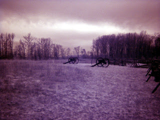
With the first image (originally a black and white photo) I played with the saturation and the burn levels. I didn't do too much of that with the first project, so I thought this would give me an opportunity to do so. The second picture is a picture we took at the beach last year. I tried to enhace the contrast in the colors of the sunrise. I did not use any tutorials. I just played around for a little while. I like the first picture, but I think the colors in the second picture could be blended a little more, but could not figure out how to get that done.
Langganan:
Posting Komentar (Atom)
Blog Archive
-
▼
2008
(195)
-
▼
Oktober
(38)
- magazine proj
- one minute border photoshop tutorial
- wired
- Magazine Cover
- Arnold Yun- My magazine
- Mag Cover
- Photoshop Tutorial
- Found Type
- the other one wasnt as big, but I think you can se...
- SERIF FONT
- Font
- Photoshop Tutorial
- Serif
- Tutorial/Playing with Photoshop
- Found Type
- Found Type
- Found Type
- Found Type
- Tutorial
- Tutorial: Half Sepia
- Tanpa judul
- Captured Life
- Tutorial
- LIFE
- Captured Life
- Half Sepia
- Life
- Half Sepia + Bangbros
- Online Tutorial-Halloween Chick
- Captured Life
- Life
- Life?
- Life
- Life
- Life
- LIFE
- Lunch atop a skyscraper
-
▼
Oktober
(38)
0 komentar:
Posting Komentar